A gentle game to keep memory active
The project at a glance
Summary
A web-based memory game designed for users aged 50+, blending UX design, cognitive psychology, and game mechanics to encourage daily memory training through gentle, accessible play.
My Role
- Senior Product Designer
- Led full design process: research, branding, UX/UI, prototyping, testing
Tools
Figma, Notion, Bootstrap, Pen & paper
Date
March 2024
1. The Starting Point
Nobody asked for this project — I realized I had to do it.
The idea for Fonograpp began with my grandmother. Watching her navigate the challenges of aging while dealing with Parkinsons made me realize how few tools there were to support cognitive health in a warm, accessible, human way.
Many memory-training apps exist, but most feel clinical, confusing, or just plain dull. What I wanted to create was something gentle and joyful — a small ritual that could help people over 50 keep their minds active every day, without pressure or friction.
That was the real problem to solve: how do we design a habit, not just a tool?
2. My Role in the Project
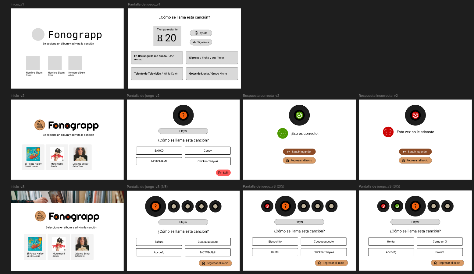
I led the project from end to end — from initial concept and paper wireframes to a fully functioning product, built and launched with a small agile team in just one day.
My work included:
- UX research & strategy
- Brand and interface design
- Game mechanics and cognitive design
- Usability testing and iteration
- Copywriting and visual asset creation
This wasn’t just a design exercise. It was a personal mission.
3. How I Tackled It
I focused on making the experience easy, meaningful, and repeatable — blending game design, psychology, and UX principles to support memory through play.
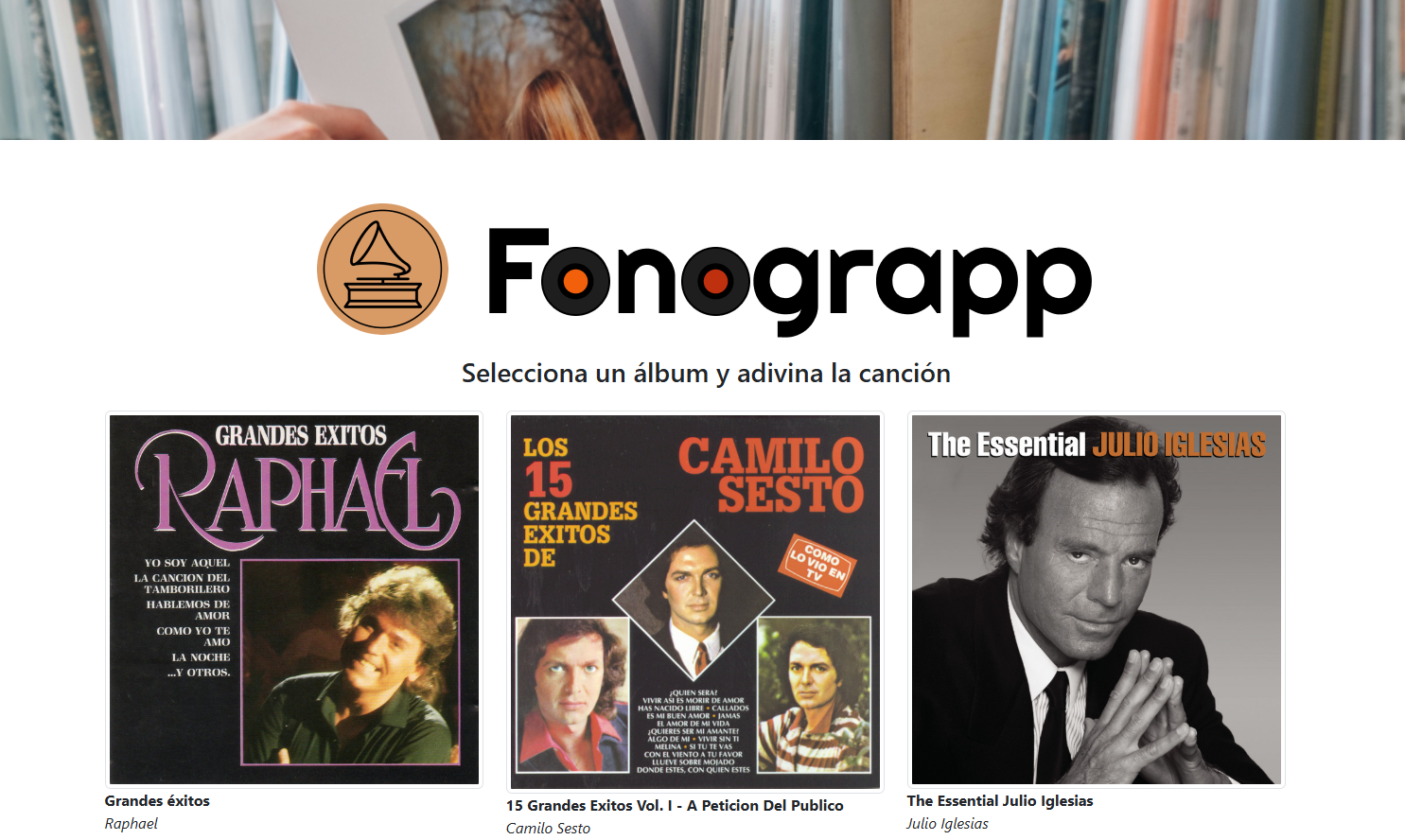
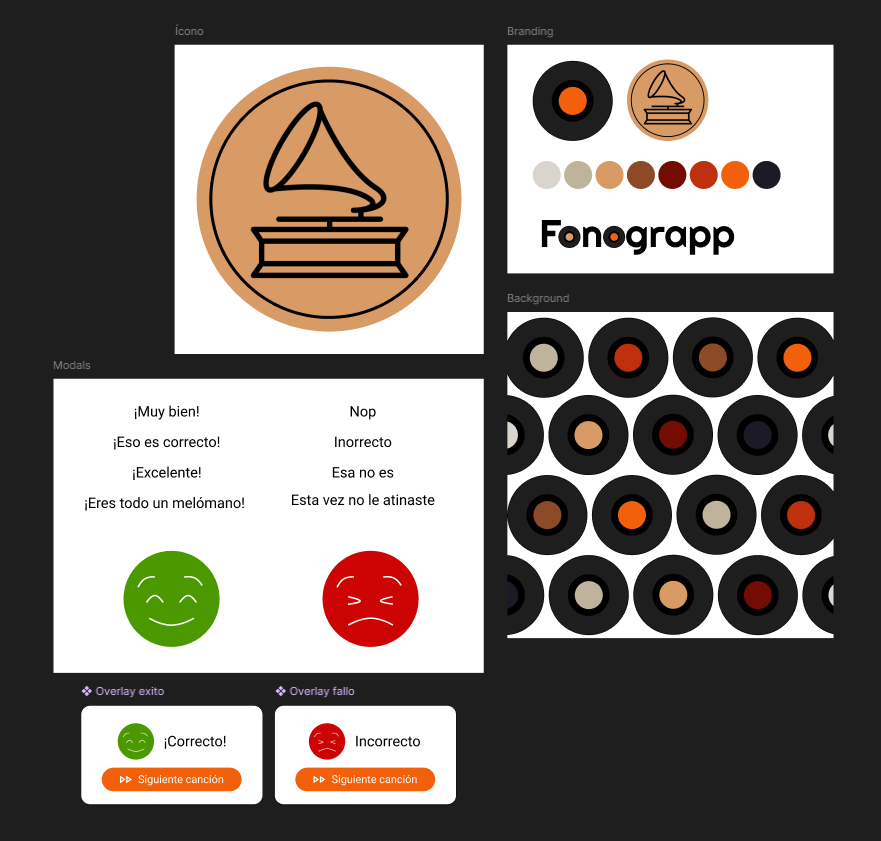
🎨 A Soft, Trustworthy Brand
I created a visual identity that felt playful and comforting, using round shapes, soft colors, and simple typography — intentionally steering away from techy or medical aesthetics.
The tone had to feel like a conversation, not a diagnosis.
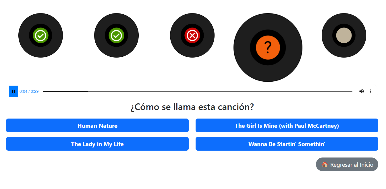
🧠 Design for Real-World Cognition
To make the experience both intuitive and effective, I applied accessibility guidelines alongside behavioral design patterns:
- High-contrast buttons
- Minimal text and clean visual hierarchy
- Calm pacing — no timers, no distractions
- Audio-visual pairing (match a sound to an image or word) to trigger memory recall
These elements were designed to reduce cognitive load and gently encourage interaction.
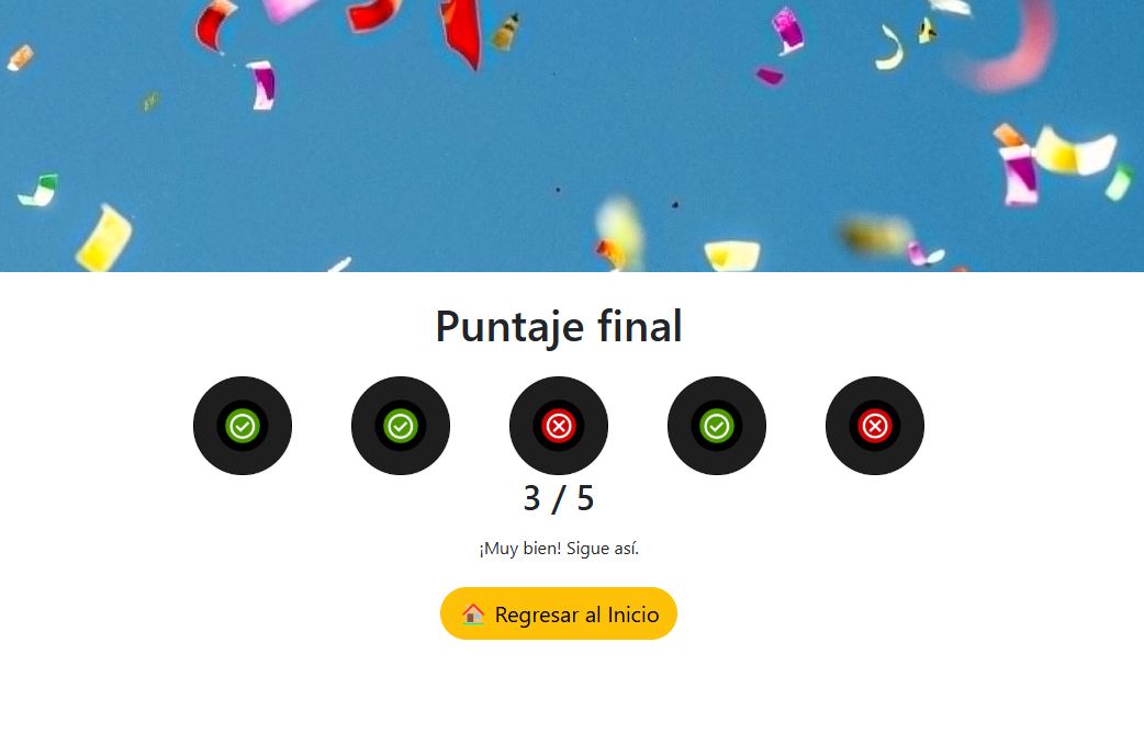
✍️ Language That Encourages, Not Judges
I crafted microcopy that motivates through kindness:
“Nice try! Want to give it a new go?”
These small affirmations helped transform mistakes into learning moments — an essential principle of inclusive design.
👵 Testing With Real Users
I conducted usability tests with older adults and their caregivers, collecting both qualitative and quantitative data. Their feedback helped improve:
- Game pacing
- Interaction clarity
- Audio quality
- Visual feedback for correct/incorrect answers
The design became more thoughtful because it was shaped directly by the people who would use it.
4. What Came Out of It
We launched the first version of Fonograpp within a single day using agile workflows — and it immediately found traction. Check it out here.
Within the first month:
📈 Daily active users increased by 50%, with many returning day after day
🧩 People described the experience as “fun,” “relaxing,” and “easy to stick with”
🧓 Caregivers reported that their loved ones felt more confident and engaged
More than a product, Fonograpp became a moment of quiet consistency — a game that made users feel capable, not tested.
5. What I Learned
This project showed me the power of proactive design — identifying a problem before it’s requested, and building something with heart.
It also deepened my appreciation for:
- Human-centered UX as a cognitive support system
- Behavioral design as a habit-building tool
- Emotional resonance as a usability metric
It reminded me that good design is invisible — and that clarity, empathy, and ease are far more powerful than flashy features.
6. What I’d Keep Improving
While the core game is simple by design, I’d love to keep evolving it through:
- Themed sound packs (e.g., 80’s pop, 60’s films soundtracks, one hit wonders)
- A lightweight caregiver dashboard for tracking use
- Localized versions for community centers and therapy programs
I also see potential in customizing content to reflect users’ own lives — making the experience even more personal and memory-triggering.
7. Why It Mattered
Creating Fonograpp helped me close a personal loop — turning concern into action, and design into care. Without forgetting to have some fun along the way!
It’s a project that reminded me why I do this work: to make things a little easier, a little brighter, and a little more human for someone else.
And like every case study I write, it’s also a reflection tool — a way to learn, move forward, and design the next thing better.