Weekly Cinema Schedules, Without the Clutter
The project at a glance
Summary
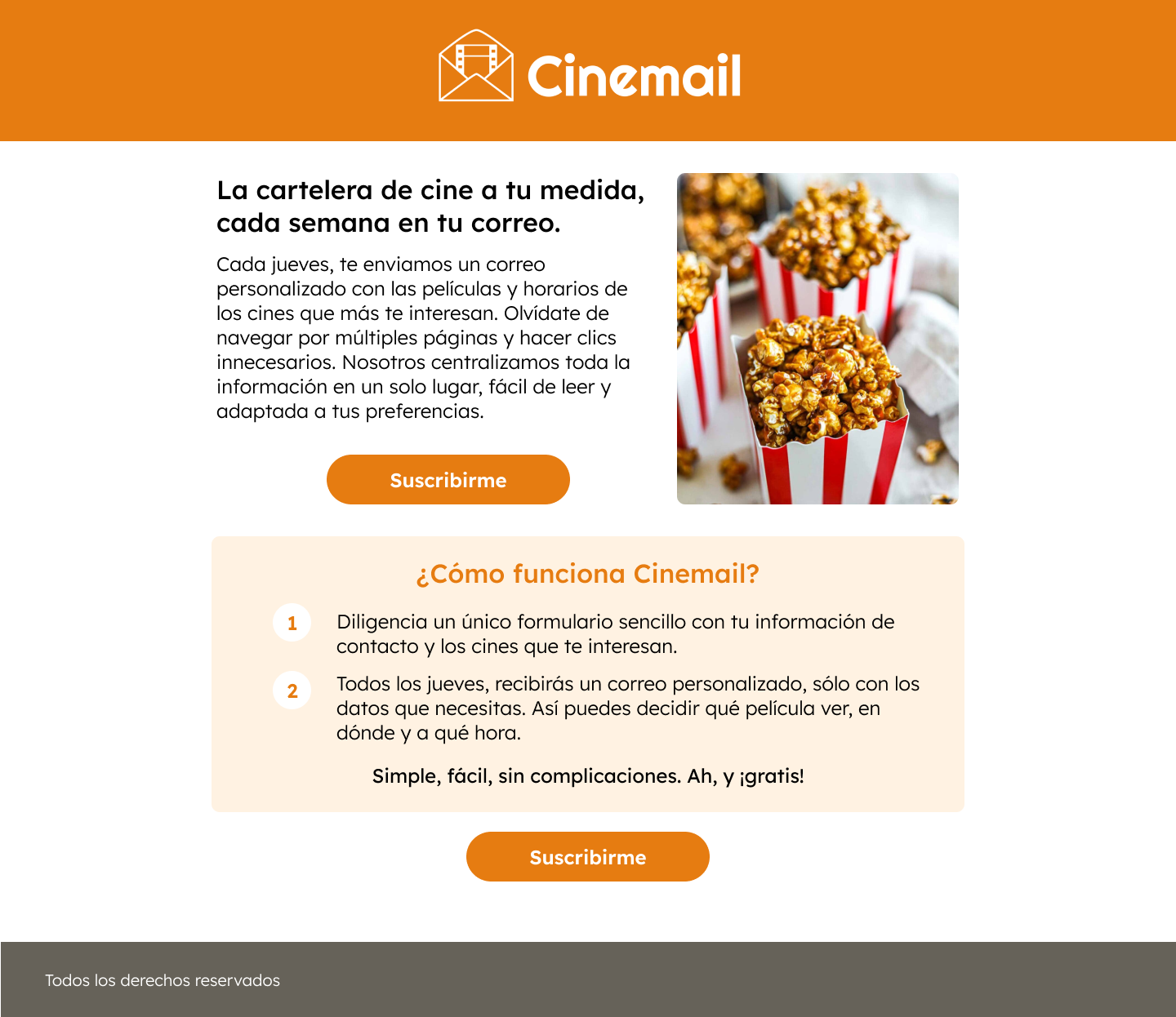
A minimalist, hyperlocal service that delivers weekly cinema schedules via email—no ads, no noise, just the essential movie info. Designed to save users time and reduce friction for local moviegoers in Querétaro, Mexico.
My Role
- Senior UX/UI, Product Design and Owner
- Brand identity
- Copywriting
- Front-end development
- User research & testing
Tools
Figma, Notion, Google Sheets, HTML, CSS
Date
March 2025
1. The Starting Point
This project began as a personal frustration. I was tired of the endless clicks, ads, and clutter just to find out what was playing at my local movie theater.
Most people I spoke to felt the same. All they wanted was a simple way to know what’s showing nearby—no distractions, no unnecessary info. That sparked the idea: what if there was a cleaner, kinder way to stay informed?
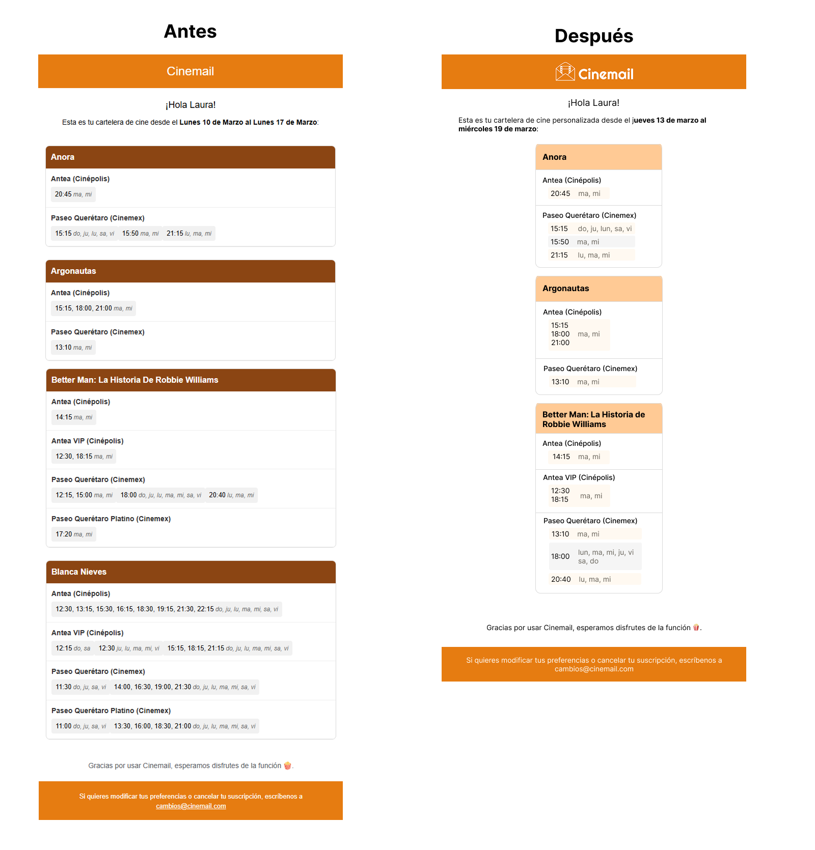
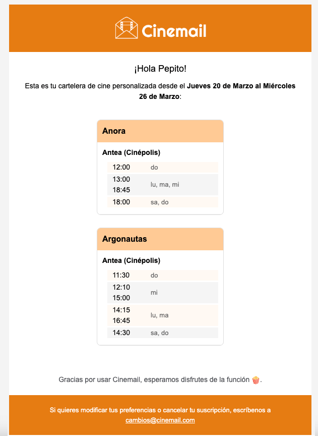
So I co-created Cinemail, a weekly email service that delivers only the essential: local cinema schedules, sent once a week, tailored to your preferred theaters.
2. My Role in the Project
I wore many hats—this was a hands-on, full-stack design effort from idea to launch. My role included:
- Leading the product strategy and design process end-to-end
- Creating the brand identity, from name and logo to visual system
- Designing and building the front-end experience (landing page + form)
- Writing all copy, with a strong focus on tone and clarity
- Collaborating with developers to build the email delivery system
- Conducting user testing to validate and iterate on the concept
3. How I Tackled It
This project was about intentional simplicity—stripping away what wasn’t needed and focusing on what actually helped.
Designing Less, but Better
I didn’t start with sketches and low-fidelity wireframes. I started with research, and with a friendly reminder that not everything needs to be a website or an app. The design had one main goal: let the user subscribe with minimal effort. Every decision pointed toward that.
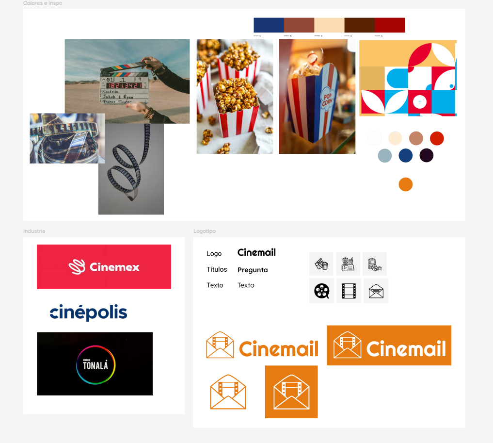
Crafting a Clear Brand
The name “Cinemail” was chosen for its clarity and memorability (I also made sure the domain was available). The identity is soft and warm, intentionally avoiding loud, cinematic clichés. It’s meant to feel like a small local service you can trust. The main inspiration was actually an old newspaper!
Choosing the right format
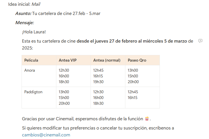
Knowing most people would check their inbox on their phone, we decided against a website as the platform for our solution. What the user really needed was a weekly e-mail. And what we needed from them could be gathered through a simple form, so we created a simple landing page. The layout was designed to be scannable, readable, and clutter-free.
Copy that Sounds Like a Friend, Not a Platform
The tone across the product is relaxed and helpful—closer to a personal recommendation than a marketing pitch. That voice became central to the user experience.
Testing Early and Often
I ran tests with local moviegoers in Querétaro and got feedback on everything from word choice to layout hierarchy. Their comments helped simplify and refine the service before launch.
4. What Came Out of It
Cinemail turned a multi-step chore into a single, trusted moment each week. You can see it here.
- Users could check their inbox once and know what’s playing—no apps, no digging.
- The weekly email saw high open and engagement rates.
- Time spent searching for movie info dropped by 40%.
- 95% of users reported satisfaction with the experience, especially appreciating the “no-frills” format.
It became a small, meaningful tool for a specific group of people—and that was exactly the point.
5. What I Learned
What started as a personal frustration turned into a surprisingly universal insight. I originally designed Cinemail to solve my own annoyance with local cinema listings—but once it launched, I discovered it resonated deeply with others, especially people with ADHD and older adults.
These users weren’t just grateful—they were relieved. The simple format, lack of distractions, and predictable rhythm of a weekly email gave them a sense of ease and trust. It reminded me that good design often comes from paying close attention to our own pain points—and testing whether others feel the same.
6. What I’d Keep Improving
Right now, we’re focused on growing the community behind Cinemail. The goal is to connect cinephiles—not through another social platform, but through shared habits and curated content. We’re exploring ways to create space for people to recommend local gems, talk about what they’ve seen, and maybe even organize movie nights.
The core product will stay minimal. But the experience around it? That can evolve in ways that feel equally lightweight, thoughtful, and human.
7. Why It Mattered
Cinemail proved that simplicity is not just a design choice—it’s a strategy. In a digital landscape overflowing with notifications, autoplay trailers, and “what to watch next” algorithms, it offered something refreshingly different: relevance without noise.
It mattered because it showed that users value products that respect their time, attention, and preferences. And it reminded me that solving small, real-world problems can have a surprisingly wide ripple effect—especially when you design from empathy, not assumptions.