A project that started with a look
In 2020, a Spanish maker published the Yayagram: a physical device that let elderly grandparents receive voice messages from family through large tactile buttons, no touchscreen, no password, no learning curve. The device deliberately replicated the telephone handsets of their grandmother's era, because familiarity removes friction in a way that no onboarding screen can. The idea spread because it was designed for a specific real person, with constraints taken seriously instead of worked around.
I came across it and it stayed with me. Not as a product to copy, but as a way of working: look clearly at who you are designing for, resist the defaults, and build something that fits their actual life.
My grandmother has Parkinson's. People with Parkinson's and Alzheimer's benefit from regular memory exercises, which help slow cognitive deterioration. The science on this is reasonably clear. What is less clear, from the products on the market, is whether anyone has thought hard about whether those exercises are something a person actually wants to do.
I had watched my grandmother try. Her doctor recommended memory card games, the kind where you flip pairs and match them. She played a few times and stopped. She was frustrated by the exercises and quickly uninterested. But then a song she loved would come on, and something shifted. She lit up. The memory was there, accessed through a different door.BE
That observation was the brief. If I could bring more of those moments to the process, build something around the music she already loved, it would be worth building.
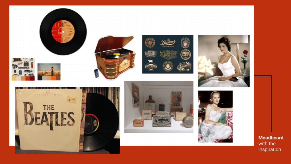
Visual direction: familiar, warm, analog
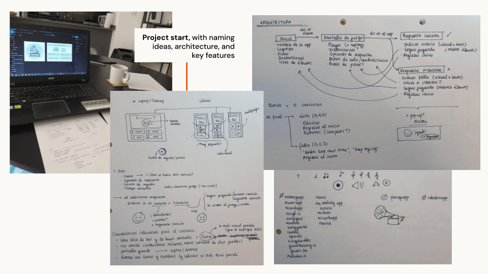
February 17, 2024. Paper wireframes, naming research, and Figma open simultaneously.
The design question
The products that existed were not designed for her. They were general cognitive training tools, built around the logic of games: escalating difficulty, scores, timers, progress ladders. Not wrong, exactly, but optimizing for the wrong outcome.
I did not start from the market gap. I started from her. However, understanding what already existed helped me name the decision I was already making: I was not building a game. I was building a habit.UX
That distinction changes almost every design decision downstream. A game asks: how do I make this challenging? A habit asks: how do I make this something she will want to do again tomorrow? BE Those questions produce different answers. A game adds difficulty to maintain engagement. A habit removes friction, removes anxiety, removes anything that makes the experience feel like a test she might fail.
For someone with a degenerative condition, a daily activity that reminds her of decline is an activity she will eventually stop doing. The design had to feel like a song she liked coming on, not like homework.BE
What was built, and what was left out on purpose
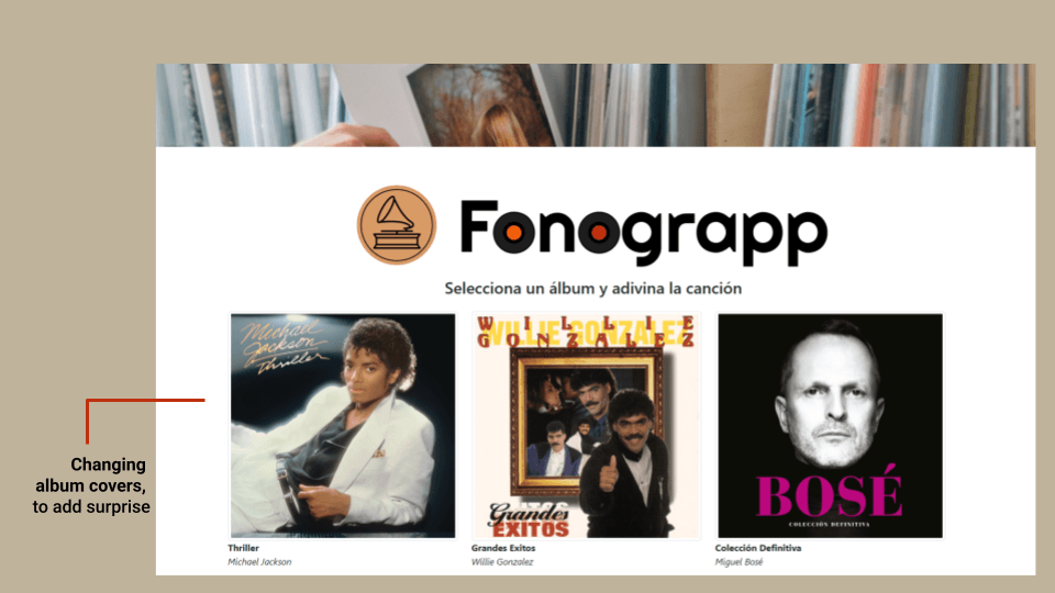
Fonograpp plays a short audio sample. The user identifies the song from four options. Five rounds, then done. The interface is in Spanish, because that is her language. The songs span Spanish and English depending on the artist, because her music does too.
The mechanics are minimal, and every exclusion is a decision.UX
- No timer. Timing creates urgency where none is needed and anxiety where it is harmful. She should take as long as she needs.
- No competitive scores. Nothing to beat, nothing to lose. The activity is its own endpoint.
- No login. A login screen is a friction point and a potential failure moment. If she cannot remember her password, she stops. The game opens and starts.
- No increasing difficulty. Samples stay consistent throughout. The goal is engagement, not escalation.
- Encouraging copy throughout. The interface tells her that not remembering is fine. The language is warm and specific, designed to prevent the moment of self-criticism that turns an activity into a reminder of loss.
- Her actual music, on request. Because Tarmiga built it, the music library is not generic. It includes her favorite artists and records, and new albums can be added directly when she asks. That closeness between user and product is part of what makes the habit possible.
- Rotating album covers on the homepage. Different covers load each session, which gives a reason to return each day without requiring progress or improvement. The variety is the pull.
- Familiar visual language. The album art replicates physical vinyl record cases, the large square format she grew up with, for the same reason the Yayagram replicated telephone handsets: the familiar removes a layer of cognitive effort before the game even begins.BE
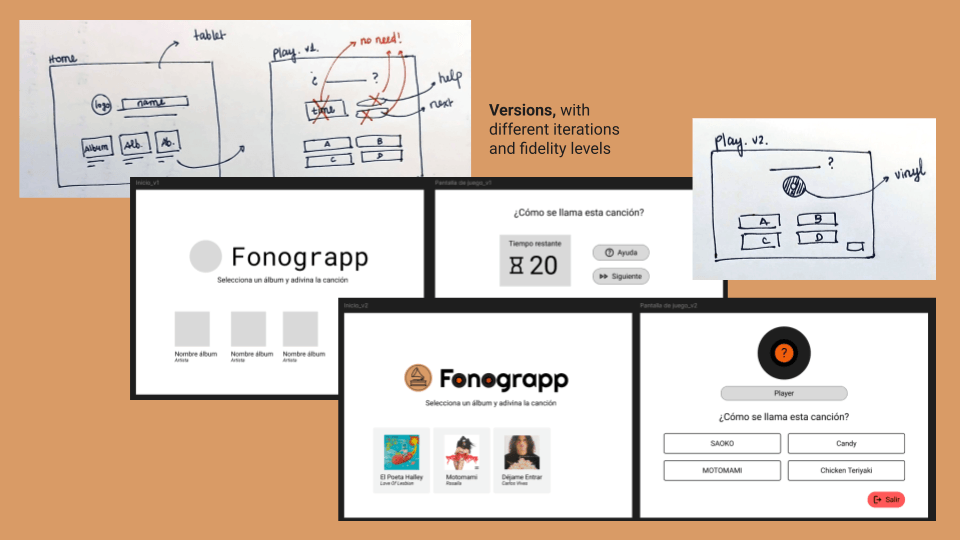
Different iterations of the design.
Designed for a tablet, from the start. Not as a responsive afterthought, but as the primary format. A tablet sits on a table, does not require being held, and has a screen large enough to read comfortably without squinting. Buttons are large and easy to press. The layout assumes a user who may have reduced fine motor control, which Parkinson's directly affects. Accessibility here is not a checklist item. It is a consequence of knowing who is sitting in front of the screen.UX
A round indicator. Five rounds, current position visible, with each past round marked green or red depending on whether she got it right. Added after testing. Without it, users did not know how long the session would last, which produced low-level uncertainty. The indicator resolves that without adding competitive pressure: it tells her where she is, not how she ranks.IE
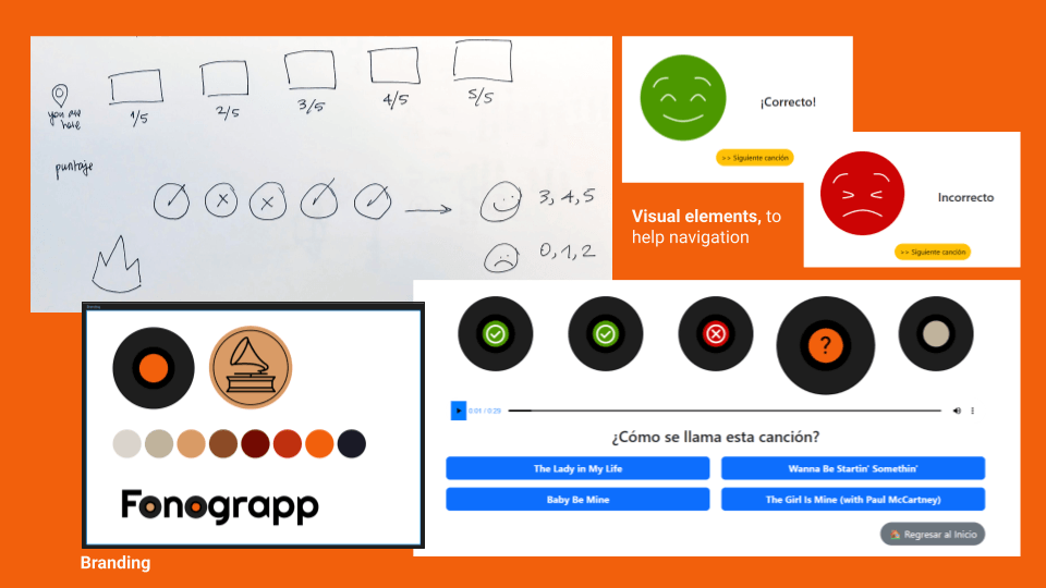
Branding and visual elements for clarity.
She liked it. That was the test.
When feedback pushed toward competition, the design held
After v1 launched, family members and friends tried the game at home. The feedback was consistent: make it harder. Shorter audio clips. Add a timer. Give people a score to beat.
These requests were reasonable from their perspective. They found the game easy and wanted more resistance. However, they were the wrong requests for the person the game was built for.
Harder clips would cut off recognition before the memory could do its work. A timer would introduce exactly the anxiety the design had been built to prevent. Competitive scores would reframe a quiet daily habit as a performance, which is the one thing a habit-forming model cannot survive.
Holding the design meant being clear about who it was for. My grandmother is the user. The family members who wanted it harder are not. A design that serves her has to resist the pull toward mechanics that would satisfy a different audience.UX
What changed
Before Fonograpp: The exercises recommended for my grandmother existed but felt like tests. Memory card games, timed matching, structured difficulty. For someone with a degenerative condition, a test you might fail is a test you eventually stop taking. No habit formed, because no one had designed for the person who needed to form one.
After Fonograpp: Five rounds of music, in her language, with her artists, on a tablet she already owned, no password, no competitive score, no sense of failure. She plays it. She comes back. The moment a song she loves comes on and she gets it right, the look on her face is the outcome the design was built for.
The expansion to social gatherings was not planned. Family and friends started playing together at gatherings because the low-stakes, no-pressure format turned out to suit a group setting as naturally as a quiet afternoon: no one loses, no one is embarrassed, and a song everyone half-remembers creates a moment of shared recognition. Nothing in the design needed to change to accommodate it. That is usually a sign the core decision was right.
Fonograpp, live at fonograpp.com. v1 published February 24, 2024.
Reflection
The hardest part was not building it. It was resisting feedback from people I respected, pointing toward solutions that would have made it worse for the person it was built for.
And then those same people adopted it anyway, without a single change to the design. That is the kind of confirmation you do not plan for.
Fonograpp was never meant to be a commercial product. It was built because someone I love had been given tools that did not fit her, and I was in a position to build something that did.
Designing for a specific real person forces decisions that designing for a user archetype lets you avoid. Those decisions, made clearly and held under pressure, are what make a product worth using. Caring about who is on the other side of the screen is not separate from the craft. It is what makes the craft produce anything worth keeping.TL