Find the mental health podcast (or episode) that speaks to you
The project at a glance
Summary
A curated platform to help users discover mental health podcasts that match their specific needs—designed for calm, clarity, and real usability. Focused on building an empathetic experience that reduces overwhelm and encourages meaningful listening.
My Role
- Senior Product Designer
- Led the full design process: concept, UX/UI, research, branding, copywriting, testing, and launch
- Collaborated closely with the founding client as well as front-end development team
Tools
Figma, Notion, Posthog, HTML/CSS/JavaScript
Date
November 2024 (and ongoing)
1. The Starting Point
This project began with a call from a client who had a clear frustration and a rough idea. They were tired of how hard it was to find mental health podcast episodes that actually speak to what you’re feeling in the moment, and how little trust users had in what surfaced.
They didn’t need a full concept—they needed someone to translate that frustration into a human-centered experience.
We aligned immediately on the emotional importance of the product. The platform needed to be calm, intentional, and trustworthy—more like a companion than a search engine.
In the client’s words:
“People looking for this kind of content are already emotionally vulnerable. We shouldn’t make them work to feel better.”
2. My Role in the Project
I joined as Senior Product Designer and led the full design process—from the earliest sketches to the live beta version, and now into the next iteration.
My contributions included:
- Translating rough use cases into a coherent product strategy
- Designing the UX/UI, filters, navigation and interaction patterns
- Creating the brand identity, including naming (which took several iterations!), logo, and visual system
- Crafting empathetic, clear copy aligned with the product’s mission
- Conducting user interviews and usability testing
- Worked closely with the development team (HTML, CSS, JS) to bring the platform to life.
- Created the strategy: defined KPIs, monitoring systems, and feedback loops.
- Planning next steps for future versions based on user insights
Through all of this, I made sure the work stayed anchored in human-centered design principles, always asking: How does this help users feel seen, safe, and supported?
3. How I Tackled It
I started with research: talking to users, scanning the landscape, and mapping out typical content discovery journeys in the mental health space.
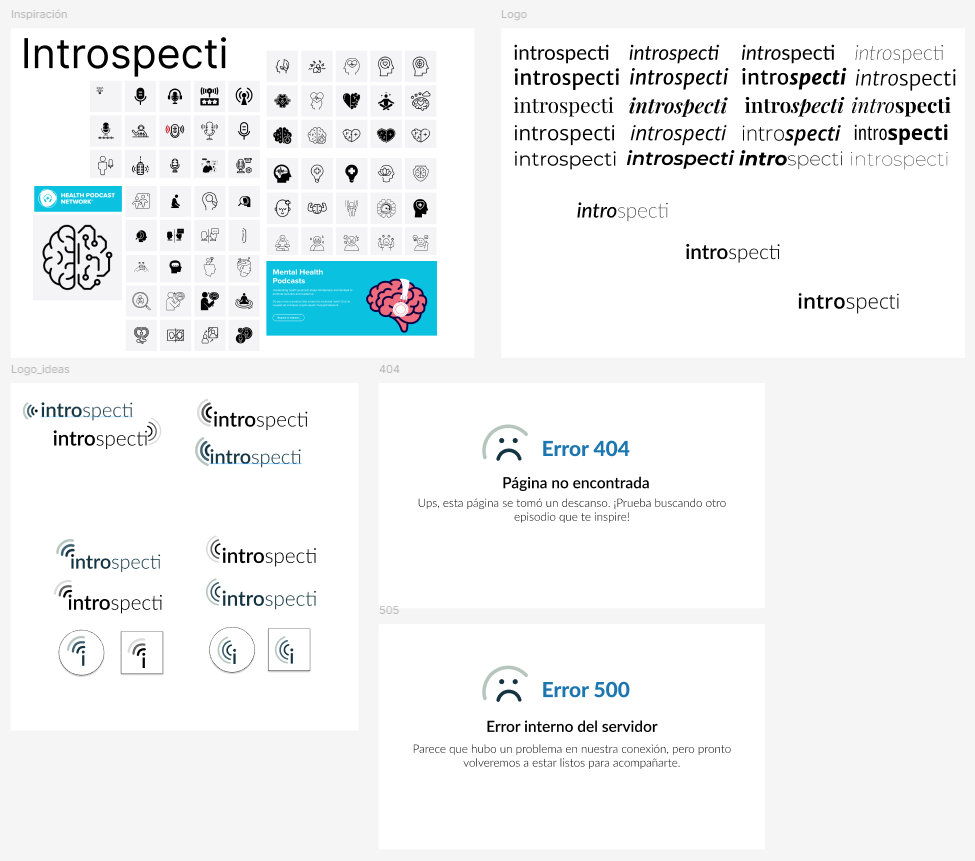
Branding & Naming
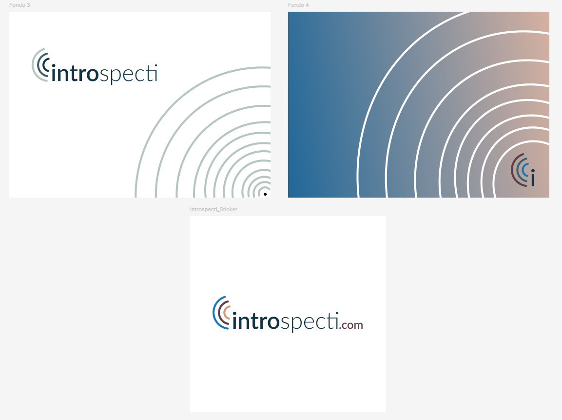
The brand needed to feel grounded and trustworthy—while remaining easy to remember and say. I led a collaborative naming sprint, and after several proposals, we landed on “Introspecti,” a name that captured the product’s essence: a space for quiet reflection and personal discovery.
I checked availability for domain registration, social handles, and ensured the visual identity aligned: calming tones, clean layouts, and a logo that speaks subtly to introspection.
UX Design
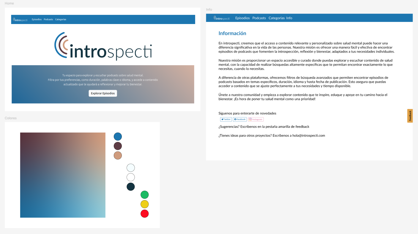
I started by mapping out the emotional journey of the user based on the tasks they want to achieve, not just their clicks.
We realized users didn’t want dozens of options—they wanted one good one that felt relevant. We defined a product philosophy based on clarity, peace of mind, and intentionality.
I led the product design with these 3 principles:
- Emotional ease over information overload
- Specificity instead of vague categories
- Guidance rather than endless search
To support this, I designed advanced filtering and curation systems based on common user goals:
“A 10-minute Spanish meditation”
“An anxiety talk from last week”
“Something beginner-friendly that helps me through a migrane”
I translated these use cases into information architecture, wireframes, and eventually high-fidelity prototypes. Every element—from spacing to typography—was chosen to promote mental ease and flow.The result was a filtering experience that actually feels helpful—not frustrating.
Strategy & Impact
Beyond design, I defined the KPIs tied to real user outcomes—like episode saves, time to first meaningful interaction, and bounce rates from search. I also collaborated on early go-to-market strategies, planning content and partnerships with podcast creators, and therapists to support growth and visibility.
Here’s a sample of the platform’s copy, which encapsulates its voice and mission:
At introspecti, we believe that access to relevant and personalized mental health content can make a significant difference in people’s lives. Our mission is to offer an easy and effective way to find podcast episodes that encourage introspection, reflection, and well-being, tailored to your individual needs.
4. What Came Out of It
We launched a thoughtfully designed platform that made it easy and meaningful to discover mental health content—right when people needed it most. You can use it here (and don’t worry, it’s free!)
Within the first few weeks, we saw:
- A 20% increase in engagement, driven by the platform’s curated filtering experience.
- A 30% improvement in user retention, thanks to intuitive navigation and content clarity.
- Positive feedback from both new users and mental health professionals, validating the platform’s tone and utility.
And we’re not stopping there: user feedback is actively shaping the next version, with improvements already in development.
5. What I Learned
Designing for emotionally vulnerable users is a humbling responsibility. It taught me to:
- Build calm into every layer of the product—not just the UI, but the structure, the pace, and the language.
- Lean on behavioral design and organizational strategy to create systems that feel effortless but are grounded in rigor.
- See branding and UX not as separate tracks, but as interconnected expressions of the same values.
6. What I’d Keep Improving
The work is never done. Especially with the current relevance of mental health content. Here are some ideas of where we could take this next:
- The current filter experience works—but the next version will introduce even more personalized recommendations, leveraging user history and intent.
- We’re exploring ways to make onboarding more empathetic for first-time users, especially those unfamiliar with podcasts.
- From a systems perspective, I’m also working on improving our analytics dashboards to provide clearer insights and support ongoing iterations.
7. Why It Mattered
This project wasn’t just about content—it was about trust, and designing with care.
Introspecti stands as a reminder that design can support emotional wellness, not by offering more, but by offering better. It also reminded me how powerful it is to work in partnership with a team that deeply understands their mission—and trusts design to help deliver on it.